Introduction
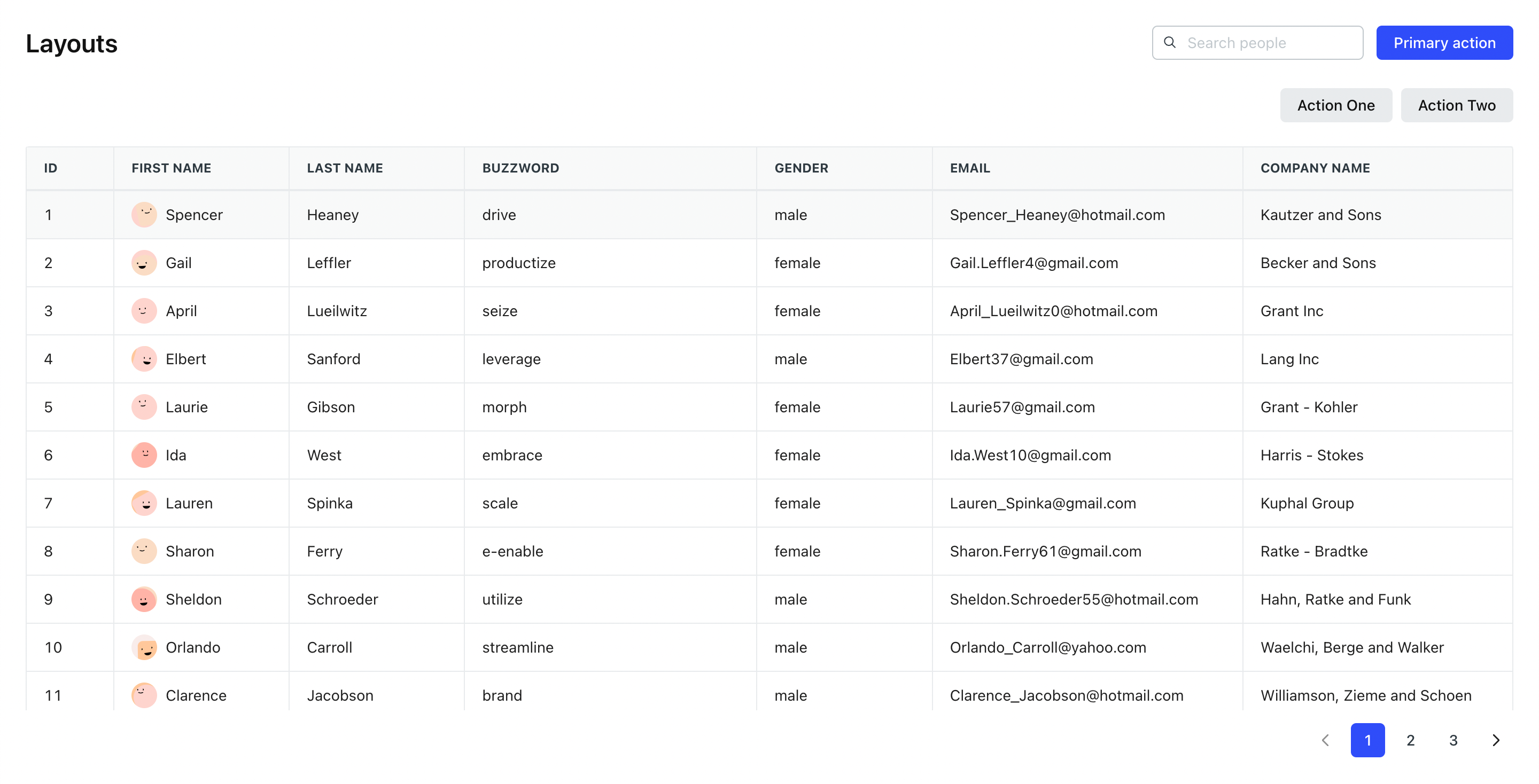
Inside neeto-products, we use lots of listing pages which contain Header, SubHeader and Table components. The Table component height is adjusted by inheriting the height of the wrapper that contains the Table component. One common headache for many developers is the need to calculate the height of sibling components and adjust the table wrapper height dynamically. This can often lead to double scroll issues and result in layout inconsistencies. However, a powerful solution which can resolve this issue is by using a generic wrapper component called TableWrapper.
The TableWrapper component serves as a wrapper for a table element. It helps to avoid the dynamic height calculation and inconsistency in heights for the parent container of the table component.
TableWrapper should be used only with Tables used in the listing layout as shown below. Container should be the parent component of TableWrapper.
<Container>
  <Header />
  <SubHeader />
  <TableWrapper>
    <Table columnData={columnData} rowData={rowData} />
  </TableWrapper>
</Container>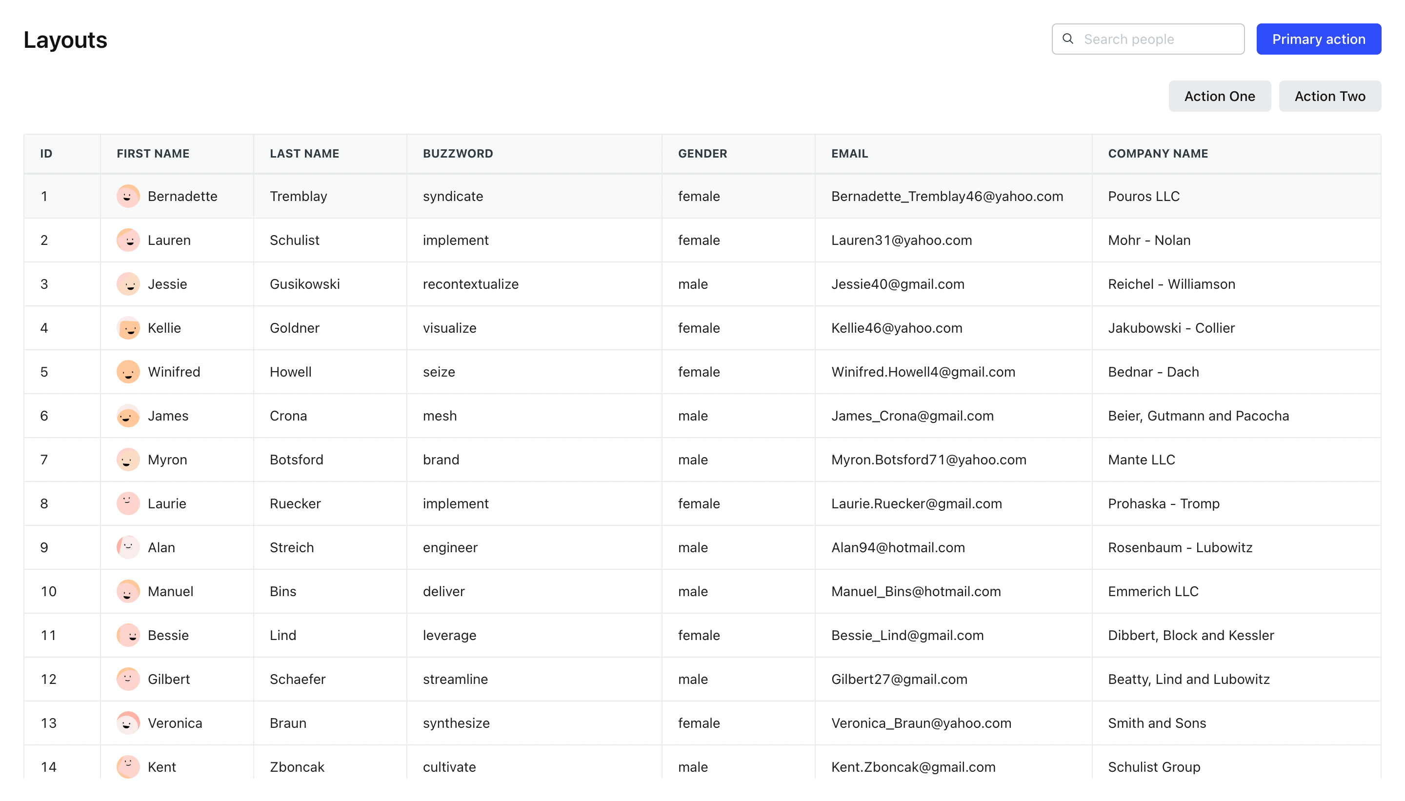
TableWrapper is a Flexbox CSS layout model designed to provide a more efficient way of arranging and aligning elements within a container. It eliminates the need for complicated height calculations and offers a flexible and intuitive approach to building responsive designs.
One of the major advantages of using Flexbox is that it allows you to create layouts without relying on dynamic height calculations. Traditionally, when working with CSS, you often need to calculate and set heights for elements to ensure they align properly. This becomes especially challenging when dealing with varying content lengths or responsive designs.
Flexbox solves this problem by providing a set of properties that control the distribution and alignment of elements within a container. Instead of setting explicit heights, you can let Flexbox handle the vertical alignment automatically based on the content and container dimensions.
Key Flexbox properties for height control
display: flex;: By applying this property to the container, you activate the Flexbox layout model. It transforms the container into a flex container, allowing you to control the behaviour of its child elements.flex-direction: row/column;: This property defines the direction in which the flex items are laid out within the container. By default, it is set torow, which arranges the items horizontally. However, you can also set it tocolumnto create a vertical arrangement.align-items: flex-start/center/flex-end;: This property aligns the flex items along the cross-axis of the container. Setting it toflex-startalign the items at the top,centeraligning them in the middle, andflex-endaligning them at the bottom.flex-grow: 1;: This property allows the flex items to grow and occupy the available space within the container. Setting it to1ensures that the items expand to fill any remaining space vertically.min-height: 0;: Themin-heightCSS property sets the minimum height of an element. It prevents the used value of the height property from becoming smaller than the value specified formin-height.
Benefits of using Flexbox for height control
Simplified Layouts: Flexbox eliminates the need for complex height calculations, making your CSS code simpler and easier to maintain.
Responsive Design: Flexbox naturally adapts to different screen sizes and orientations, providing a responsive layout without the need for media queries or explicit height adjustments.
Dynamic Content: Flexbox handles varying content lengths effortlessly. Whether you have short or long content, the items will adjust their height accordingly, ensuring a consistent and visually pleasing design.
Cross-browser Compatibility: Flexbox is well-supported by modern browsers, including all major ones, ensuring consistent behaviour across different platforms.
HTML
<div class="layout__wrapper">
  <div class="layout__container">
    <!-- Table component -->
  </div>
</div>
CSS
.layout__wrapper {
  display: flex;
  flex-direction: column;
  flex-grow: 1;
  width: 100%;
  min-height: 0;
  overflow: auto;
}

.layout__container {
  flex-grow: 1;
  min-height: 0;
}
Using TableWrapper with table contains pagination
TableWrapper height is adjusted to contain pagination element using the hasPagination prop. hasPagination prop accepts boolean value. It can be calculated using totalCount and defaultPageSize values as shown below.
<Container>
  <Header />
  <SubHeader />
  <TableWrapper hasPagination={totalCount > defaultPageSize}>
    <Table columnData={columnData} rowData={rowData} />
  </TableWrapper>
</Container>